Start with a saved report whose rows and filters you understand. Run and inspect the report before using a visualization to present its results.

Add a status chart

  1. Open Visualization and select Add chart.
  2. For a count of work by status, choose Records, Count, and group by Status.
  3. Review the chart type and any split field.
  4. Enable Show values if readers need the numbers displayed.
  5. Compare the chart with the table, then save the report.
Bar, Line, Pie, and Donut choices are available, with additional chart types under More chart types. Number format and decimal settings affect presentation; they do not establish the meaning of a metric.

Add a summary row

Open Summary Rows, choose the summary you need, and run the report. A Count summary displays a footer with the count. Other choices include Total, Average, Min, and Max. Choose a summary appropriate to the field rather than summing identifiers or unrelated values.
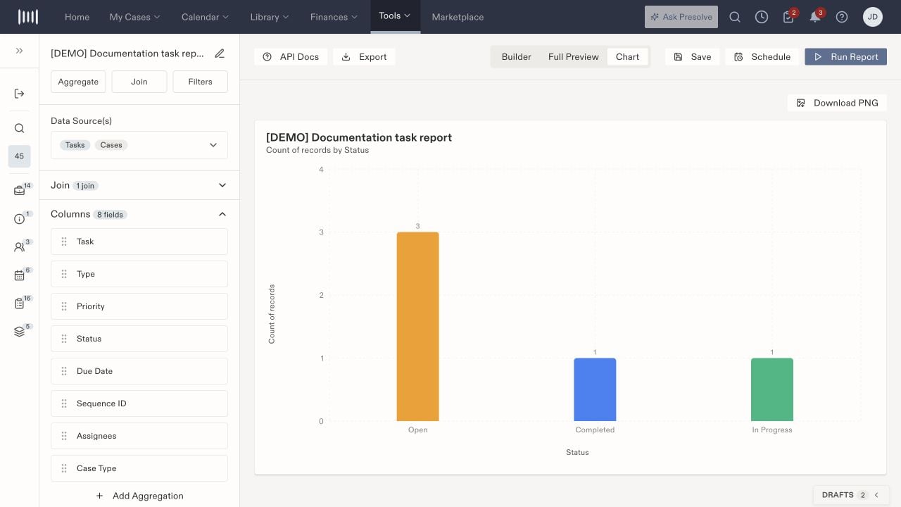
A saved report bar chart with Open, Completed, and In Progress status groups.

The Chart view displays record counts grouped by Status.

Add Aggregation is a separate control for aggregated output columns. It asks for a field, function, and output alias. Do not confuse a footer summary with changing the report’s output structure. For export or scheduled delivery, inspect the destination and resulting file independently; a chart on screen does not establish that a downloaded image or emailed report was delivered. Related: Report filters.